When making ‘Looks’ for your films, it’s a good idea to have a basic understanding of colour theory. This goes from what colours compliment each other to symbolism and what different colours denote.
Common colour matching schemes are:
- Complmentary
- Analogous
- Triadic
- Split-Complementary
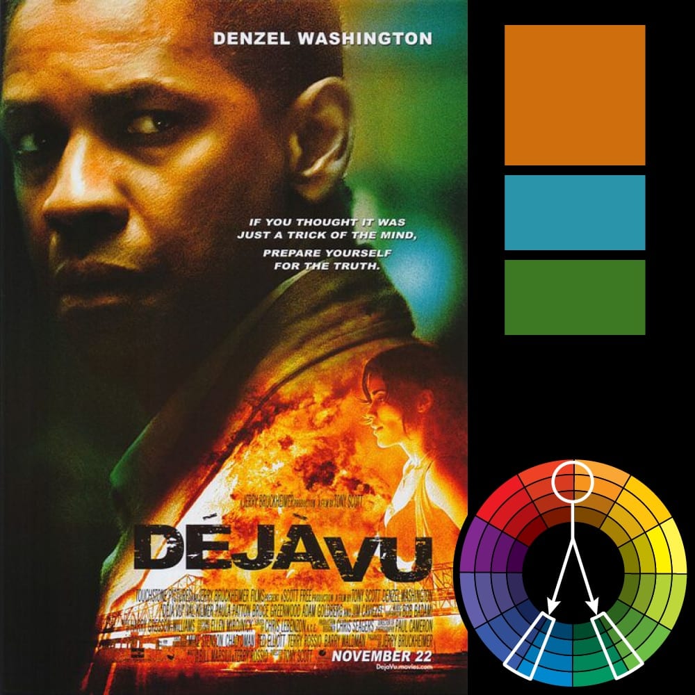
Complimentary is when the colour pallet has two colours which are opposite each other in the colour wheel, for example teal and orange. Colours that are opposite each other work very well together because of their high contrast. I mentioned teal and orange because as skin in the closest to the orange in the colour wheel, teal works very well with making the talent in the shots stand out. This can be seen in high action films such as the Avengers and even animations such as Pixar’s Brave.


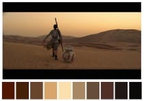
Analogous colour schemes are when colours sit next to each other on the colour wheel. They are used to create a more harmonious palate that can turn a scene warm or cool depending on where the colours sit on the wheel. Normally this sort of scheme is used in nature or landscape shots, when no one thing is contrast to the other. An example of this are the scenic shots of Jakku in Star Wars the Force Awakens. Here everything is a warm brown/orange colour that fits with the desert scenery, but also gives everything a monotonous quality which suits Rey’s life on the planet.

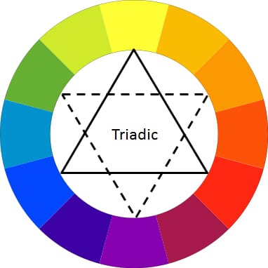
Triadic colour schemes have three colors arranged evenly spaced around the color wheel. One should be dominant, with the other two for accent. This scheme is not widely used, but when done well, can have a big impact on screen. An example of this is a scene in Scott Pilgram vs The World (see below) here you can clearly see the pink, blue and green all stand apart from each other, not giving one character importance over the other. It also establishes their characters and the videogame like world they are in.

The Split-Complementary colour scheme is similar to the complementary one, however there are 3 colours; one main one and then the two that are next to that colour’s complimentary colour. This means that there is still high contrast in the scene, enough to make the action pop, but it is less harsh than a straight complementary scheme.